Let's go.
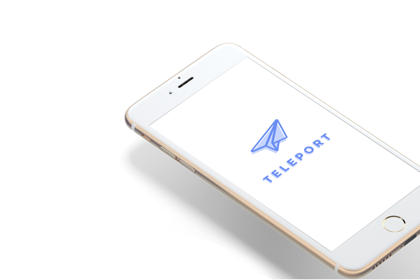
Teleportation App by Holly Jade
OverviewTeleport is a user-focused app made for people, to help them teleport to places instantaneously. Teleport allows users to instantly visit places they frequent, never-been, or re-visit. Teleport includes a feature where you can book trips for the future as well as see past places. Teleport is travel of the future all fit into an iOS mobile application.
|
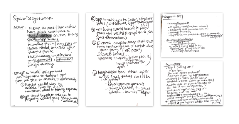
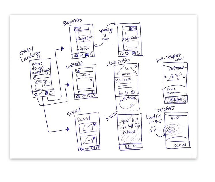
Requirements1. Sketches to show both the overall navigation of the app as well as workflows related to the requirements.
2. The app can take you to places you go often (work, home, etc). 3. The app can take you to places you infrequently visit (Eiffel Tower, Egyptian pyramids, etc). 4. You're able to view places you've teleported to in the past. 5. Express complications that arise from not having a line of sight to where you’re going. 6. Highlight how other apps or OS-level features could be integrated. |

ResearchUser research - I conducted a 3-month study gathering data and information about how women from 25-57 years old track (or tracked) their time-of-month. I first wanted to understand what methods they were using today and if they had leveraged any applications/technology to help them track their monthly flow. -- Of the women who leveraged technology, I found that more than 80% of the women interviewed did not use most of the primary features found on the UI. Most women wanted to simply log their periods and move on with their busy, day to day lives. More often than not, they would log the first of several days of their period and just hand-wave the remaining days. After interviewing and observing countless women of many ages, I found that many women wanted to simply open the app and do one of two things: Log their period OR see how soon their next period was coming. Many of the apps today frustrated women with flowery visuals, complex data visualizations, too many features/buttons, and overall polluted UI’s.
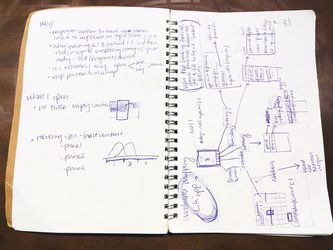
After getting a base idea for early design direction, I was able to flush out the blueprints (wireframes) for the app. Then, came high-fidelity flow diagrams to get a more defined idea of scope. To sketch we went! Next came the User flow diagram (dare I saw a flo-flow diagram… :| )
Here, I was able to get a sense of the high-level architecture and think through more concretely, the app flow. The importance of this step comes through time-saved by being able to ensure focus on primary user goal states, and simplify feature sets on any single UI screen. Through taking the time to map out the architecture pre-UI design, I was able to increase efficiency, because this step yields insight on primary versus secondary affordances/features that need to either be present or hidden and easily discoverable (features such as data visualization overviews, editing cycle dates, settings, etc.) 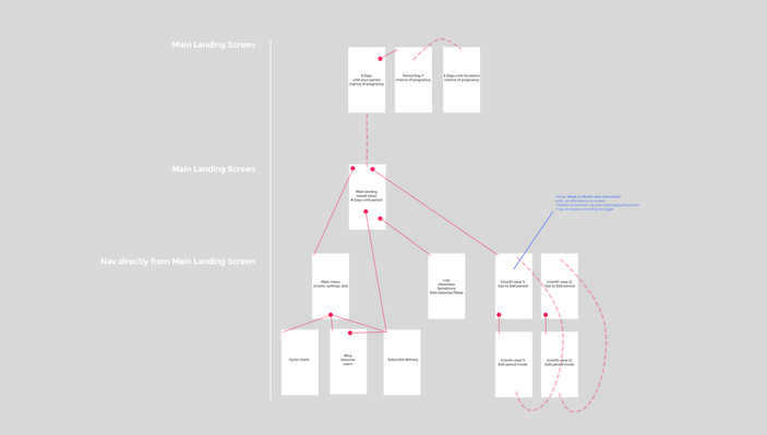
Here, I was able to get a sense of the high-level architecture and think through more concretely, the app flow. The importance of this step comes through time-saved by being able to ensure focus on primary user goal states, and simplify feature sets on any single UI screen. Through taking the time to map out the architecture pre-UI design, I was able to increase efficiency, because this step yields insight on primary versus secondary affordances/features that need to either be present or hidden and easily discoverable (features such as data visualization overviews, editing cycle dates, settings, etc.)
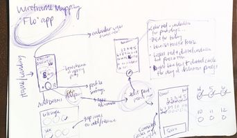
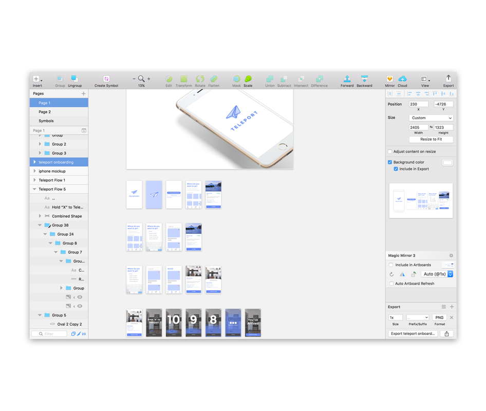
After the architecture came the specific plans for various screens. After months of research and working on paper, I was ecstatic to finally start pushing meaningful pixels. The Nitty Gritty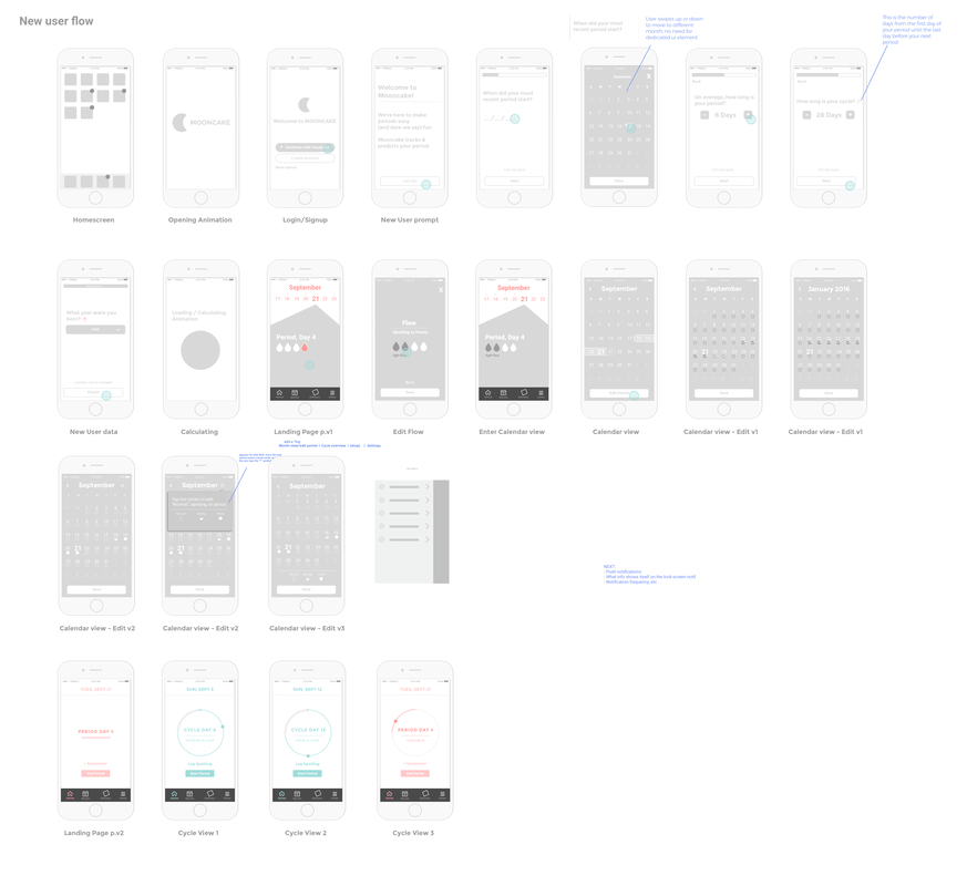
The bulk of the work comes through iterating on dozens and dozens of screens, and working in sketch after having created a few conceptual paper prototypes. The fluidity and fidelity of working in Sketch (as opposed to an off the shelf prototyping program such as balsamiq) allows for deeper customization, getting closer to the feel of the product early on. Here, I share only a fraction of the screens needed to make this application. Simplifying the application from the very start was the goal, making sure that we're not bloating the usability with extra features that don't ultimately have a net positive on the user's experience.
Of the 12 months of making this app, I spent 3 weeks working on the interface guide to ensure consistency across both the product and web presence, and with that came the making of the brand. The brand concept for mooncake comes hand-in-hand with the playfulness I wanted for the app from the very start. OutcomeIn the final stage where high-fidelity comes to play, I was able to get a sense of the detailed interface architecture and think through more concretely, the app's flow and simplify even further without jeopardizing the UX. The importance of this step comes through time-saved by being able to ensure focus on primary user goal states, and simplify feature sets on any single UI screen. Through taking the time to map out the architecture pre-UI design, I was able to increase efficiency, because this step yields insight on primary versus secondary affordances/features that need to either be present or hidden and easily discoverable (features such as data visualization overviews, editing cycle dates, settings, etc.)
After the architecture came the specific plans for various screens. After months of research and working on paper, I was ecstatic to finally start pushing meaningful pixels. The application is in development and aimed to be released in late 2018. 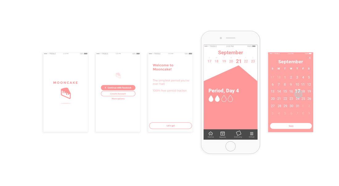
|