Ladies First
Your simplest period. Period.
Your Cycle, SimplifiedMooncake is a user-focused app made for women, by women -- to help them track their time-of-month. Every women spends more than 2k days tending to aunt flo (that's more than 6 years of her life...it's absolutely peanuts!) As a female designer I was frustrated with how out-of-touch all the period trackers on the market, were. They were complex, bloated UI's that gave far too much information and were feature-crazed. I did a little digging and to my surprise I found that the top applications were either led by males or foreign-based. It was no wonder that the designs that existed, were capped at catering to my needs as an American female with a super busy schedule. I just wanted to track my cycle in a blink, and move on with my day.
|
PRODUCT OVERVIEWAs a women in today’s world, I leverage technology where I see it to be a fitting and natural solution to making life easier - Everything from leaning on software for my morning gym routine to keeping on schedule for my daily calendar. After benchmarking various period tracker apps, I found that the leading ones were: Led by men, foreign to the US, poorly designed and/or catered to women only looking to get pregnant. Why was it so difficult to find a simple, well-designed women-led, period app? Being a modern day feminist who is also a designer in silicon valley, I felt in my gut that I wanted to do this. It was meaningful for me to design an app that served women, by women. -- Mooncake is the simplest period tracking app. For ladies, by ladies.
The goal is to create an ultra simple period tracking app that allowed women to have a friction-free period. While also, designing a friendly and quirky brand to integrate as a key component of the company’s UX. |
Design Deliverables: A Peek Behind the ScenesUser research - I conducted a 3-month study gathering data and information about how women from 25-57 years old track (or tracked) their time-of-month. I first wanted to understand what methods they were using today and if they had leveraged any applications/technology to help them track their monthly flow. -- Of the women who leveraged technology, I found that more than 80% of the women interviewed did not use most of the primary features found on the UI. Most women wanted to simply log their periods and move on with their busy, day to day lives. More often than not, they would log the first of several days of their period and just hand-wave the remaining days. After interviewing and observing countless women of many ages, I found that many women wanted to simply open the app and do one of two things: Log their period OR see how soon their next period was coming. Many of the apps today frustrated women with flowery visuals, complex data visualizations, too many features/buttons, and overall polluted UI’s.
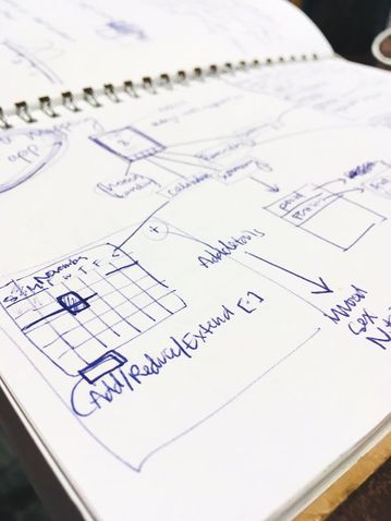
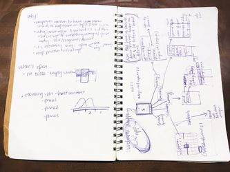
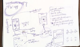
After getting a base idea for early design direction, I was able to flush out the blueprints (wireframes) for the app. Then, came high-fidelity flow diagrams to get a more defined idea of scope. To sketch we went! Next came the User flow diagram (dare I saw a flo-flow diagram… :| )
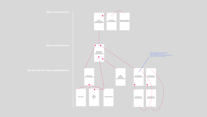
Low + Medium Fidelity DesignI was able to get a sense of the high-level architecture and think through more concretely, the app flow. The importance of this step comes through time-saved by being able to ensure focus on primary user goal states, and simplify feature sets on any single UI screen. Through taking the time to map out the architecture pre-UI design, I was able to increase efficiency, because this step yields insight on primary versus secondary affordances/features that need to either be present or hidden and easily discoverable (features such as data visualization overviews, editing cycle dates, settings, etc.)
After the architecture came the specific plans for various screens. After months of research and working on paper, I was ecstatic to finally start pushing meaningful pixels. 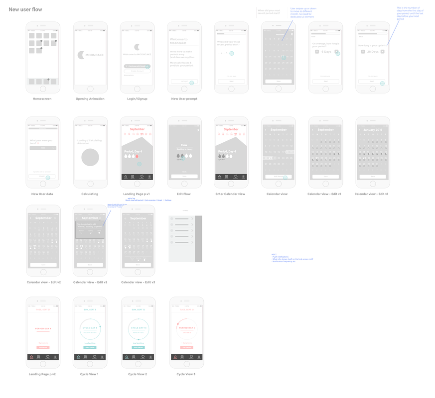
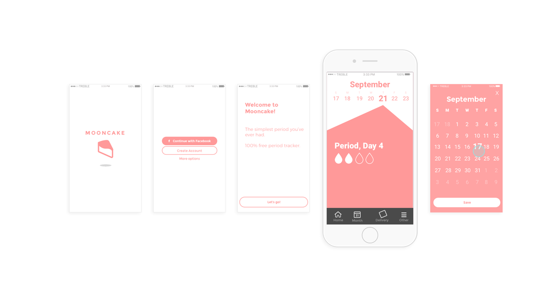
The bulk of the work comes through iterating on dozens and dozens of screens, and working in sketch after having created a few conceptual paper prototypes. The fluidity and fidelity of working in Sketch (as opposed to an off the shelf prototyping program such as balsamiq) allows for deeper customization, getting closer to the feel of the product early on. Here, I share only a fraction of the screens needed to make this application. Simplifying the application from the very start was the goal, making sure that we're not bloating the usability with extra features that don't ultimately have a net positive on the user's experience.
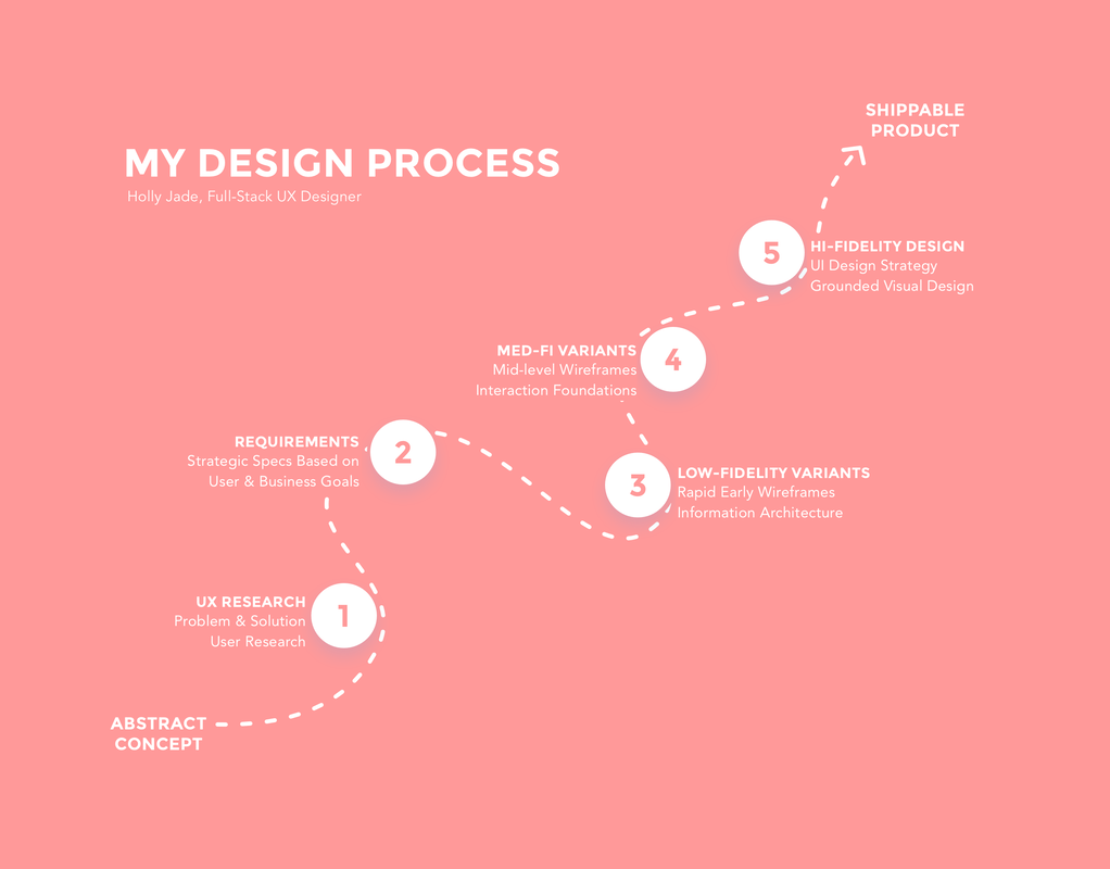
spent 3 weeks working on the interface guide to ensure consistency across both the product and web presence, and with that came the making of the brand. The brand concept for mooncake comes hand-in-hand with the playfulness I wanted for the app from the very start. Conclusion + Next Steps. In the final stage where high-fidelity comes to play, I was able to get a sense of the detailed interface architecture and think through more concretely, the app's flow and simplify even further without jeopardizing the UX. The importance of this step comes through time-saved by being able to ensure focus on primary user goal states, and simplify feature sets on any single UI screen. Through taking the time to map out the architecture pre-UI design, I was able to increase efficiency, because this step yields insight on primary versus secondary affordances/features that need to either be present or hidden and easily discoverable (features such as data visualization overviews, editing cycle dates, settings, etc.). This app as any, is very user research intensive, and thus an expansion, simplification, refinement, and pivot of the app will be expressed as research is gathered to reduce friction in the user goal. For a more holistic view on my work, please visit my process.
|