BOUNDLESS, SEAMLESS TRANSPORT
The travel industry is a a multi trillion dollar industry, making up a significant portion of the world's economic activity. Companies and my network are always curious to see expressions of my design work, and oftentimes my work is under NDA, so I decided to create an open case study for the travel industry! Adding a bit of delight as I do, I decided to design an app for not only travel, but... teleportation!
Problem: People love to travel, people need to travel, and people want to travel. Some of the core reasons people do not are due to costs, logistical difficulty, and timeliness.
Solution: What if you could go across the world (or space) through the touch of a button? What if you go somewhere regularly on a local level, but could increase the effectiveness (reduce time and cognitive load)... what if you could automate these trips and plan them in advance without much thought? I present to you, Teleport, an app that allows users to not only teleport, but allows for seamless visits to new and recurring places. Teleport is not only an app to be used for global and universal travel, but it allows users to seamlessly do routine visits to places such as the kitchen or bathroom. Enjoy.
To define the core user flows of the app, I first had to kick off the project with user research to best define the user goals. From there, that's how the rest of any application's user flow is determined. For, what's an app that doesn't help a user achieve their goal? (An abandoned one!) -- Determining the user goals for this app wasn't as straight forward as "help the user get from point A to point B." The user research extended itself to understanding what currently exists for travel, and what are the user's core pain points based off of this?
User Research + Strategy
User research uncovered that users in the travel industry's biggest pain points are:
- Timeliness: Travel takes up a lot of time, from getting to the airport, through the airport, etc. Moreover, ground transportation is typically slower.
- Logistics: The overhead and amount of effort/resources that it takes to travel tends to be a large barrier for users. Users travel less frequently than they would otherwise due to the mental and physical cost of logistics and travel.
- Cost: Travel is expensive. This one relates to point #2 as logistics doesn't come for free. Whether it's ground or air transportation, travel tends to be a large cost for the average user, and thus is seen as a luxury as opposed to something that's more of a regular recurring activity.
User Journey Maps before User Flows
After determining a lot of the user research by defining the core users, understanding their needs/desires, and stating their goals based on research -- it's time to start understanding how to piece together the user journey before figuring anything out to do with the interface and UI architecture.
The user journey differs from the user flow in that it's a high level map to help understand how the user will go through their goal from start to finish. Rather then getting too into the weeds, focusing in on the start to end flow is an effective strategy to keep the bigger picture in mind and then from there, the key app design details will follow.
The user journey differs from the user flow in that it's a high level map to help understand how the user will go through their goal from start to finish. Rather then getting too into the weeds, focusing in on the start to end flow is an effective strategy to keep the bigger picture in mind and then from there, the key app design details will follow.
|
|
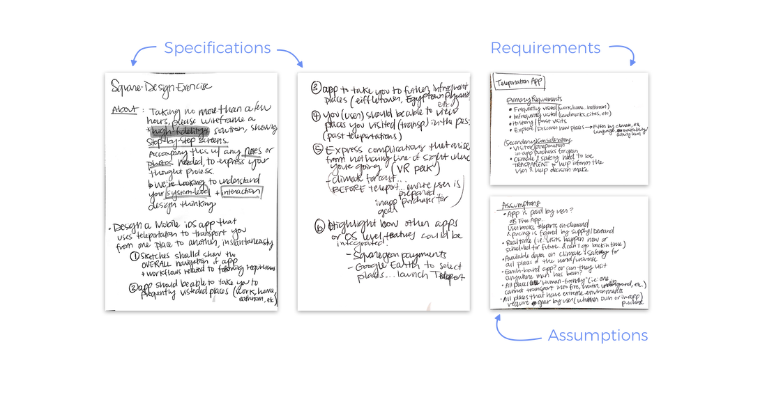
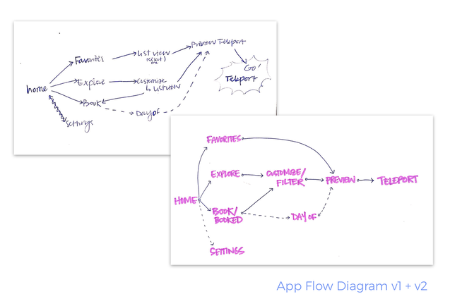
Once the user journey map is defined, it's important to always continuously check back into the stakeholders. See my design process for reference. After validation and a few iterations of product specifications and user journey mapping based on user goals, it was time to begin low-fidelity ideation on the user flow diagram. Below is a quick peek at one of the iterations for this application's user flow variations. Typically, there will be a couple key meetings with stakeholders and users if we're ever so lucky to circle in on what's key, and how to create an experience that gets users to their goal as quick and seamless as possible.
From a UX standpoint, it was important for the user to access 4 key actions from the main landing:
From a UX standpoint, it was important for the user to access 4 key actions from the main landing:
- Explore: This is the primary tab that the user will land on, and rather than be separate from the Home screen, it acts as the app home screen. Explore is the very primary function of the application, as the app's goal from a business standpoint is to nudge the user to transport to as many places as possible on the app. In order to promote this behavior, it's important to have Explore as the first-seen primary feature.
- Favorites: Places that the user has bookmarked in both an aspirational and recurring format. This tabs is an all encompassing tab that gathers both places that the user frequents as well as would like to visit. A second version after the MVP of the application, would include a more granular "Favorites" interaction where the user can sort by sub-groups within Favorites.
- Booked: This tab allows the user to visit past and upcoming, planned trips. As you will see, the app is designed in a familiar format, that's not leveraged enough by other applications. Rather than sorting trips in a static list format, the trips are sewn together to be perceived as a timeline visual so it invokes a feeling of going forward and backward in time.
- Settings: This tab of the application may also be interchanged with a user profile view. During this stage of the design, the stakeholders may have a specific direction that makes more sense depending on business goals and secondary actions. Here, the design expresses it as a Settings tab as opposed to a profile tab, due to the nature of not scoping out this app's social features/functions. However, if I were to make any changes, switching this to a profile tab would be one that I would support for business purposes (increasing social use, and therefore network effects of the application).
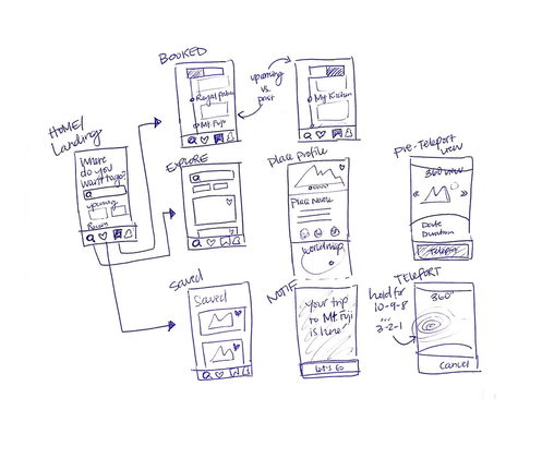
Key User Flows + Core App Screens
Once the key UX research and foundational User Experience is determined, typically medium fidelity mocks are worked through a project to solidify architecture and information/copy decisions.
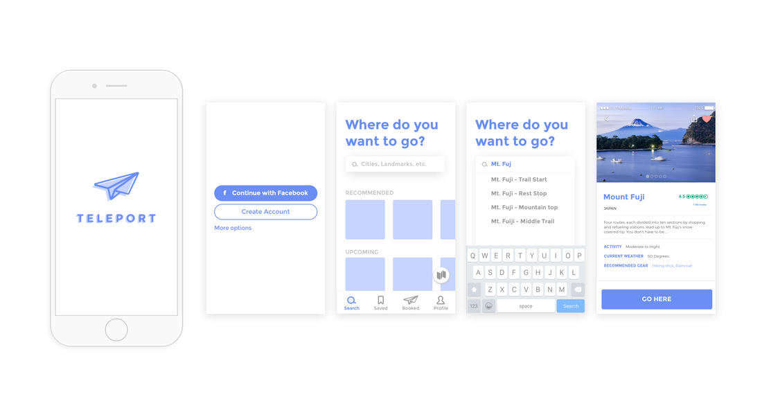
Below are the core app screens that are an expression based on user research, user goal definition, and stakeholder needs. You'll notice that there is a monetizations strategy that addresses the business goal within the application as well. As a designer with a strong funded startup background, I'm constantly ensuring business objectives are met in conjunction with advocating for the user.
Below are the core app screens that are an expression based on user research, user goal definition, and stakeholder needs. You'll notice that there is a monetizations strategy that addresses the business goal within the application as well. As a designer with a strong funded startup background, I'm constantly ensuring business objectives are met in conjunction with advocating for the user.

The key flows for the application were based on the 4 key tabs: Explore, Favorites, Booked, and Settings (profile).
- User On-boarding: user-onboarding to land on "Explore." During user-onboarding the user is familiarized with the app's branding and visual aesthetic. This is core for building the emotional relationship with the user, and influencing the perceived quality of the application from a psychological and emotion-based response. In other words, this flow relies mostly on visual design relative to the remainder of the application which has a balanced emphasis on UX and tech reliability.
- Search + Discovery: This is the primary tab that the user will land on, and rather than be separate from the Home screen, it acts as the app home screen. Explore is the very primary function of the application, as the app's goal from a business standpoint is to nudge the user to transport to as many places as possible on the app. In order to promote this behavior, it's important to have Explore as the first-seen primary feature.
- Saving + Booking: This extends itself from the Favorites interaction. As a user is exploring, they may bookmark/favorite/save places. Places that the user has bookmarked in both an aspirational and recurring format. This tabs is an all encompassing tab that gathers both places that the user frequents as well as would like to visit. A second version after the MVP of the application, would include a more granular "Favorites" interaction where the user can sort by sub-groups within Favorites.
- Core Action of Transport: This key user flow is one method of the user actually transporting from one location to the next. To prevent accidental travel, the user must continuously hold down on a target spot of the screen to complete the transaction. Augmented reality may be leveraged and further designed to be more in-tune with real life expectations and specified target destination.
- Planning + Reviewing: As users both plan and complete trips, this function is where they can review past and upcoming travels. The interface is designed in a linear timeline format that allows the user to see in a visualized context, all the trips over time. High resolution imagery and media are included within the trips in a clean format to add context to the places, while keeping it organized and simple. The goal is to ensure balanced (ideally low) cognitive load while adding enough context so the user can recognize each trip without the need to read closely.
Conclusion
The purpose of this project was to showcase some of my work in a non-NDA fashion, while still hitting on some of the key steps in my design process. While the tech for Teleportation doesn't exist (#yet), it's important to note some of the key considerations in designing the UX for this application.
This project's key user goals determined the core functions and key flows of the application to be
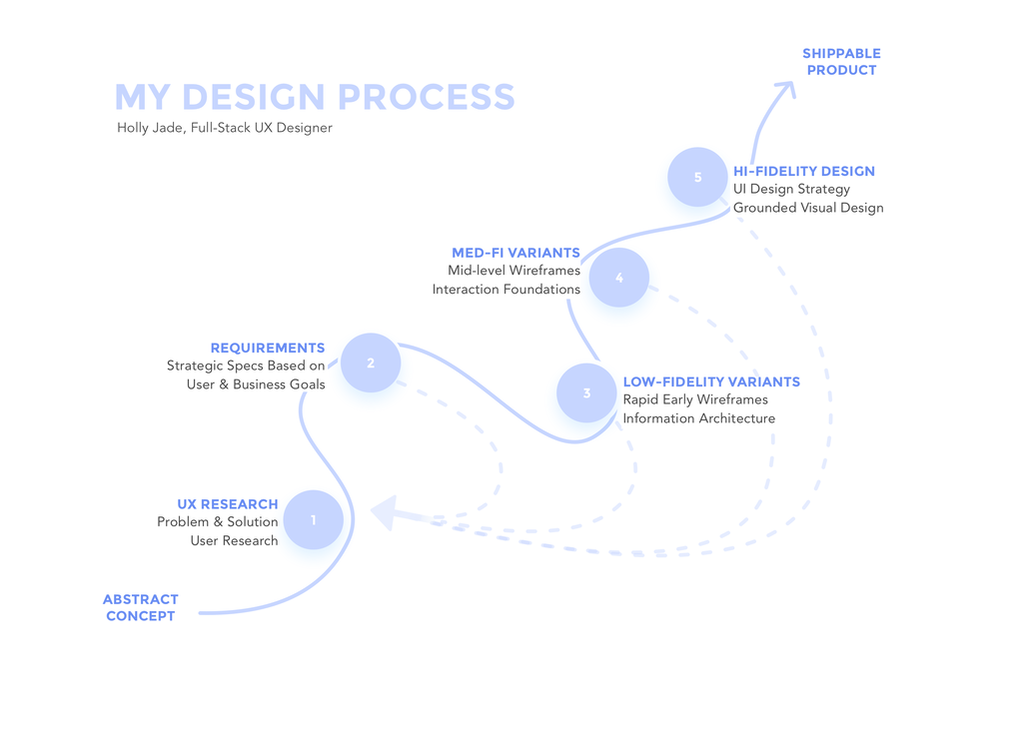
Below is a visual of my design process that's been built over the 7+ years of my design career. This project is to showcase only a couple highlighted steps in a real-world fashion of deliverables. They are only one expression of infinite possibilities, as stakeholder feedback, meetings, strategy, user research, etc. play a critical role in influencing the outcome of any given project.
This project's key user goals determined the core functions and key flows of the application to be
- Key actions: Explore, Favorites, Booked, Saved
- Key user flows: User On-boarding, Search and Discovery, Saving and Booking, Core Action of Transport, Planning and Reviewing
Below is a visual of my design process that's been built over the 7+ years of my design career. This project is to showcase only a couple highlighted steps in a real-world fashion of deliverables. They are only one expression of infinite possibilities, as stakeholder feedback, meetings, strategy, user research, etc. play a critical role in influencing the outcome of any given project.
Thanks for reading.
Want to get in touch? Message Holly.
Want to get in touch? Message Holly.