Pet Adoption Case Study
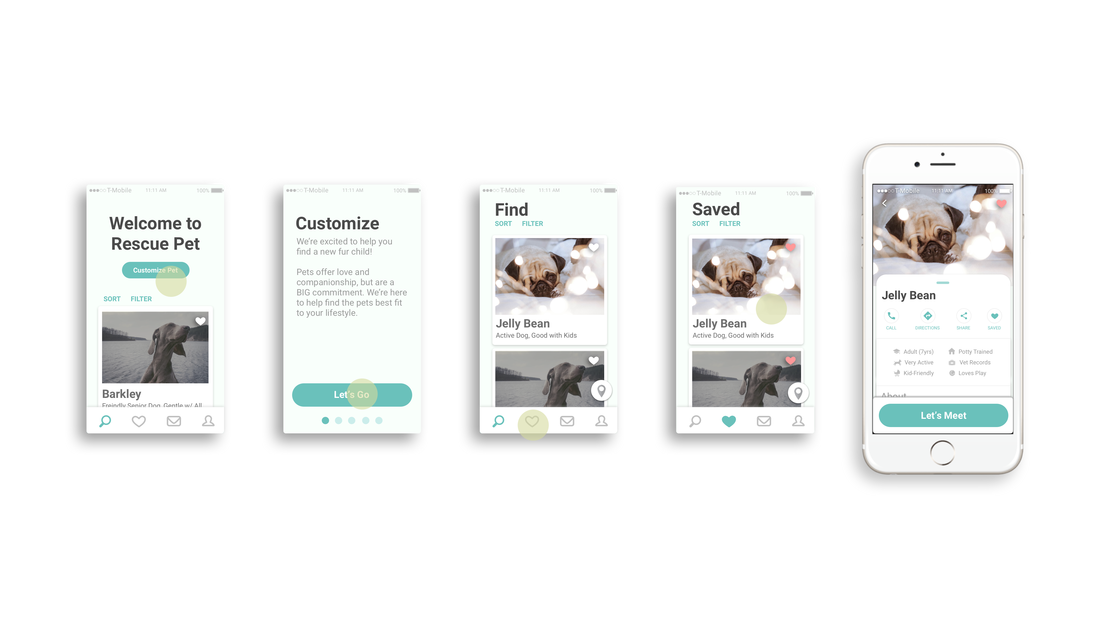
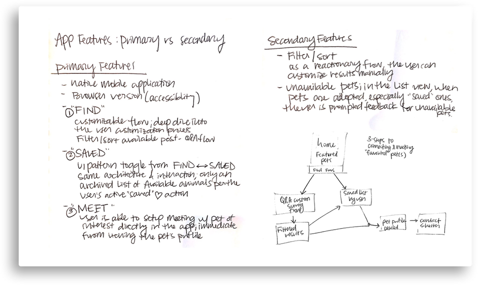

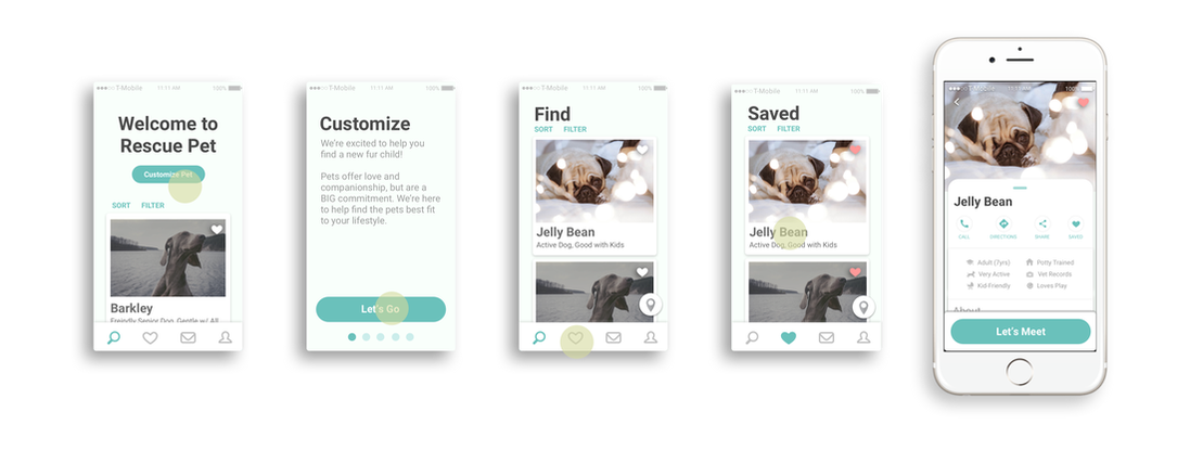
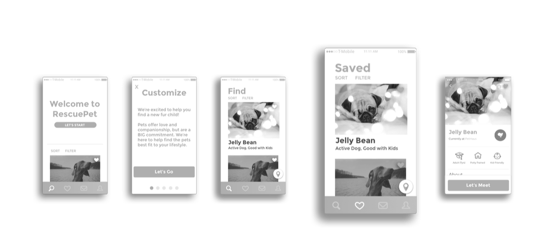
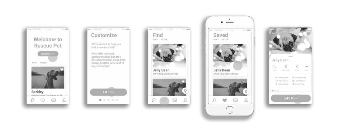
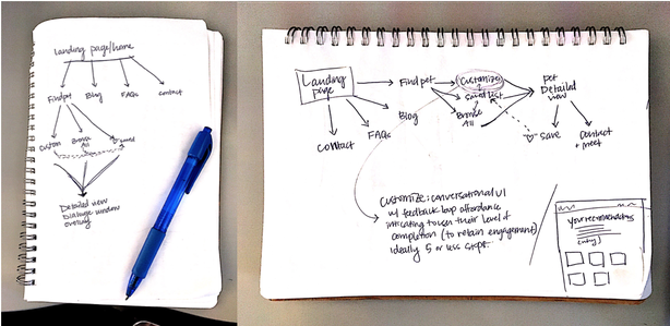
Lofi wireframing + mapping flow
|
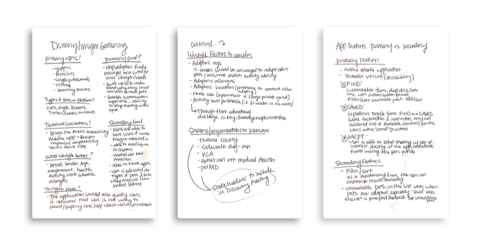
Key Findings
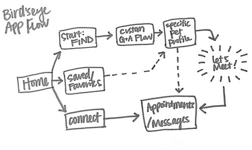
___________________________________ Q. Who are the primary users? Who are the “Adopters?” A.Young professionals, Families, Couples, Single middle-age professionals, potential for Retirees/Seniors Q. What kinds of animals are commonly found at shelters? A. Cats, Dogs, Rabbits, Turtles (“normal” pet suspects) - primary animals found on rescue sites Q. What are the technical considerations? A. Design a platform that is accessible to the mass public; an Application will be the primary design as it is a contained and controlled environment. Additionally, hosting on web for immediate accessibility as this is where many Adopters get their start. Promote the app on the site at the very top. Q. How should the app customize a pet to an adopter? A. Adoptees will be matched rescues on the basis that’s best suited for their lifestyle; they will also be qualified through the app, as we can't assume all people are ready to adopt (for example, someone who can't commit to daily needs). To overcome discrimination in the process, ensure the results are “recommendations,” and help guide users decision making process to overcome biases (for example, a user might think they want a puppy, but they’d actually be much happier off by adopting a well-behaved and trained adult dog because of their busy lifestyle). Ensure the user understands these are only recommendations based of their lifestyle inputs, which can be edited fluidly. Q. What factors should be considered when making a match? A. Lifestyle factors including Breed, Gender, Age, Temperament, and Health status. In my research, I found that important information to obtain from the user is to get a sense of the user’s schedule (availability), the user’s health (allergies and activity ability/willingness). Q. What things should we be optimizing for when building a pet adoption platform? A. It’s critical that the pathway to setting up in-person interaction meetings between the user and the animal is the primary goal of this application. Adopters and adoptees need to be in-person to build rapport and chemistry. Optimizing the pathway to “LET’S MEET” should be the primary focus of this application. |