Overview
Hello! First, thank you for the opportunity to partake in this design exercise. Of the 3 prompts given by Google to design for, I chose "Pet Adoption" as it aligns with my personal interest (also, my family happened to go through adoption of their own fur-child at the time of this exercise, so I leveraged them for live user research). Below, you will find a breakdown of critical steps I went through to design an application that helps Adopters find their new pets. These steps include Discovery (research and stakeholder interviews), App architecture, Contextual flow, and the final High-fidelity design. Please note this design is scalable to all types of pets.
For best results, I recommend viewing this case study on a desktop / laptop browser (or larger).
For best results, I recommend viewing this case study on a desktop / laptop browser (or larger).
My Design Process
Step 1: Research + Strategy
- Discovery Meetings stakeholders including PM’s and primary users to define User goals (i.e. Goal States)
- User Interviews / Observations / custom-selected Research Method
- Map Current “solution,” if any + list needs based off of Goal States
- Feature List (prioritizing primary versus secondary), User Flow Diagrams specific to stated User Goals
Step 2: Architecture + Flow
- User Flow Diagram
- Blueprint wireframes
- Individual Wireframes per Page or Screen
- Continuous Feedback & Research w/ PM, & Stakeholders
- Inclusive design
Step 3: Early Prototyping + Testing
- User Flow Diagram
- Specific Features Mapped
- Contextualized Interface Flow, Map Flow Details
- Continuous Feedback & Research with PM & Stakeholders
Step 4: HiFi Prototyping + Brand Integration
- High-resolution Dev Ready Design, Assets for Visual Design
- Annotation, Map Details
- Continuous Feedback & Research with Devs & Stakeholders
Step 5: Design Implementation + Development
- Annotating designs for Devs
- Making files ship-ready
- Working with Devs to ensure no loss-subtleties
- + Throughout, fostering strong working relationship with Developers
Want a peek of my design process in the works? See a project end-to-end, here.
Design Prompt
"Millions of animals are currently in shelters and foster homes awaiting adoption. Design an experience that will help connect people looking for a new pet with the right companion for them. Help an adopter find a pet which matches their lifestyle, considering factors including breed, gender, age, temperament, and health status. Provide a high-level flow and supporting wire frames.”
Research + Strategy
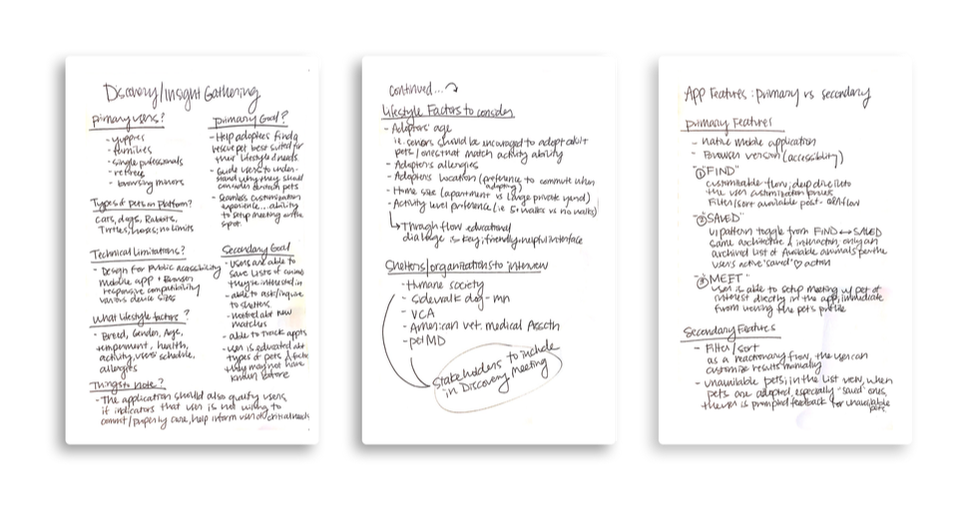
I begin 90+% design projects with a discovery/stakeholder meeting with the primary stakeholders involved. During this meeting, initial questions are asked to get a sense of the scope of the project, goal of the design, technical limitations, and things to consider. For the purpose of this design prompt, I have answered questions through basic research and considered realistic constraints, as they’d be applied to society.
User research methods applied include user interviews, observational studies, card sorting, etc.
Research, Insight, and Information for this design prompt was gathered from Dog behaviorists, the VCA Animal Hospitals, Humane Society, American Veterinary Medical Association, and others such as PetMD and Rescue owners. I used these people and organizations as the primary stakeholders, and leveraged their insight to inform the key considerations (such as how to qualify a potential adoptee), what lifestyle factors are important to consider, and what criteria are important to have when people are choosing a pet.
|
KEY FINDINGS
_______________________________________ Q. Who are the primary users? Who are the “Adopters?” A.Young professionals, Families, Couples, Single middle-age professionals, potential for Retirees/Seniors Q. What kinds of animals are commonly found at shelters? A. Cats, Dogs, Rabbits, Turtles (“normal” pet suspects) - primary animals found on rescue sites Q. What are the technical considerations? A. Design a platform that is accessible to the mass public; an Application will be the primary design as it is a contained and controlled environment. Additionally, hosting on web for immediate accessibility as this is where many Adopters get their start. Promote the app on the site at the very top. Q. How should the app customize a pet to an adopter? A. Adoptees will be matched rescues on the basis that’s best suited for their lifestyle; they will also be qualified through the app, as we can't assume all people are ready to adopt (for example, someone who can't commit to daily needs). To overcome discrimination in the process, ensure the results are “recommendations,” and help guide users decision making process to overcome biases (for example, a user might think they want a puppy, but they’d actually be much happier off by adopting a well-behaved and trained adult dog because of their busy lifestyle). Ensure the user understands these are only recommendations based of their lifestyle inputs, which can be edited fluidly. Q. What factors should be considered when making a match? A. Lifestyle factors including Breed, Gender, Age, Temperament, and Health status. In my research, I found that important information to obtain from the user is to get a sense of the user’s schedule (availability), the user’s health (allergies and activity ability/willingness). Q. What things should we be optimizing for when building a pet adoption platform? A. It’s critical that the pathway to setting up in-person interaction meetings between the user and the animal is the primary goal of this application. Adopters and adoptees need to be in-person to build rapport and chemistry. Optimizing the pathway to “LET’S MEET” should be the primary focus of this application. |
Stakeholder Quotes
"It's important to remember that there's huge benefits for adopters to consider adult dogs and cats; they're usually the ones who will have the easiest transitions because they're house trained, know how to be on a leash, and are easier to care for off the bat."
- Human Society, S. Arizona
"It's essential to find the right dog in person. When visiting a dog, consider *your own* experience. If you're an experienced dog owner, you may want to choose a more self assured dog; if it's your first dog, you might want to go with a more coy dog as their personality may be more observant."
- Cesar Millan, Professional Dog Behaviorist, 25 years experience
"I felt the size of which dog I chose was important because I live in an apartment...I narrowed the search for him down from thousands of available rescues.”
- Adopter of Raffi, adult rescue dog
Architecture + Flow
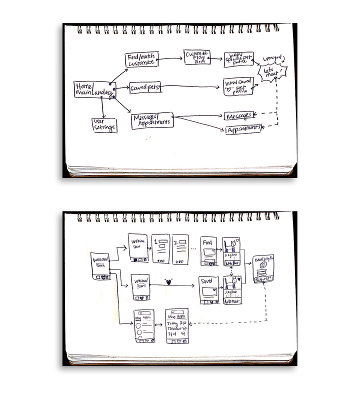
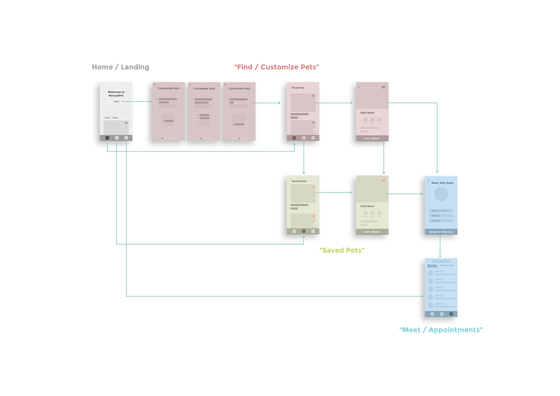
To create the app's architecture, the user research is leveraged to create a flowchart that maps out the hierarchy of the application, per the 3 primary features: "FIND," "SAVED," & "MESSAGES/APPOINTMENTS." This user flow diagram shows how the user can reach the 3 primary features anytime from the home screen, and the relationship between meeting the pet versus appointments. You can also note the linking relationship between the "find" results and "saved" list.
This dialogue then informs how to map out the app's architecture. I interviewed potential Adopters and asked them to walk through the vision of a product. Above is the result of refining and visualizing / mapping the needs of the users.
This dialogue then informs how to map out the app's architecture. I interviewed potential Adopters and asked them to walk through the vision of a product. Above is the result of refining and visualizing / mapping the needs of the users.
Prototyping + Testing
Contextual Flow
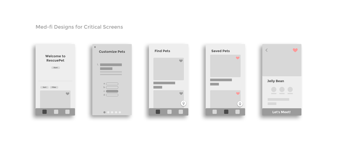
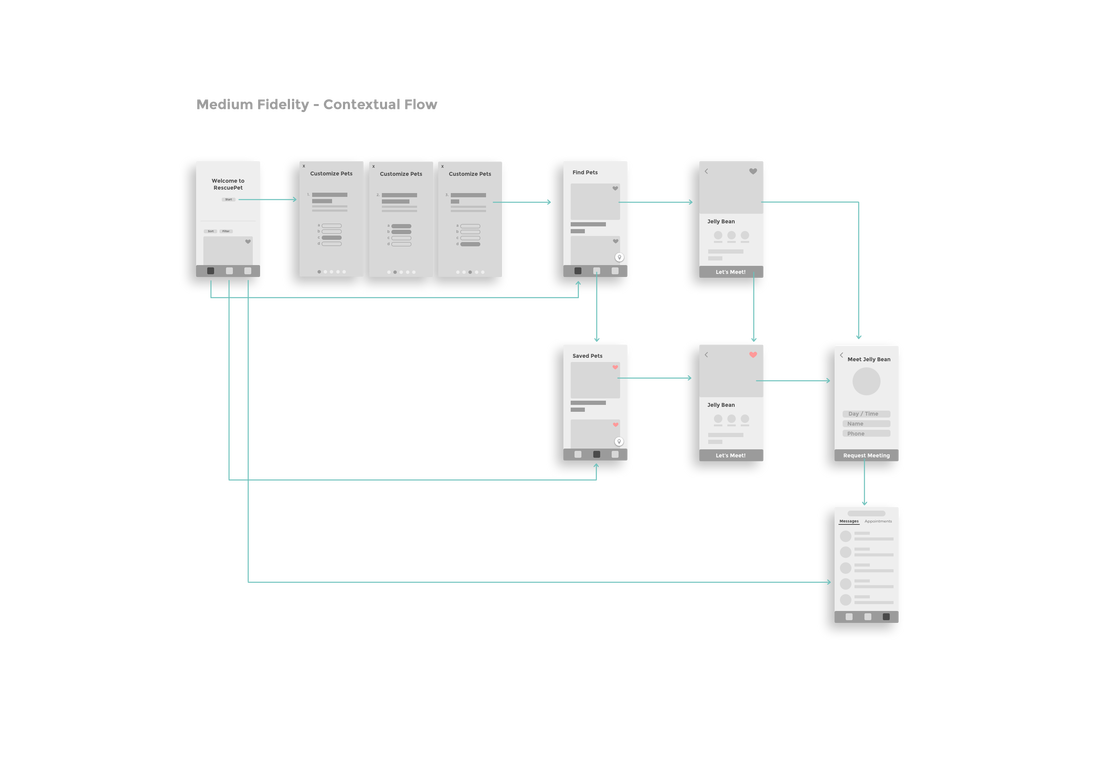
After understanding the hierarchy of the application, the stakeholder needs, gathering user research, I am now able to have a richer vision for the product direction. It was evident that the primary features were "Find," "Saved," and "Messages/Appointments." And thus, these needed to be always accessible. To do this, I mapped out a UI where the main navigation was always accessible to the user.
Note: From the key findings, we must remember the goal state is to optimize the pathway to an in-person meeting, making it as seamless as possible as this is critical to the adoption process. See solution in the contextual flow above.
Note: From the key findings, we must remember the goal state is to optimize the pathway to an in-person meeting, making it as seamless as possible as this is critical to the adoption process. See solution in the contextual flow above.
Working with a team
When demoing designs to stakeholders through the process, such as other designers, PMs, developers, etc. I've learned over the years, the super (duper) importance of properly communicating a design, regardless of what stage the design process is in. Proper communication needs depend on if you're emailing someone a design, uploading to a task-group, or leaving it in the hands of someone who hasn't yet seen it before. So much context can be lost if designs aren't properly communicated... especially in the midst of the design process. Here, I've color grouped the screens that represent each of the primary feature flows. Red is "FIND," yellow/green is "SAVED," and blue represents "MESSAGES/APPOINTMENTS."
This breakdown of coloration (and annotation, to ensure accessibility) helps stakeholders, especially PMs, designers, and devs conceptually group like-items. My goal as a designer is to ship designs that are well-communicated so that the team doesn't have to stare at the screen for very long to get a sense of what's going on. Though it can be a little more work up-front on my end, I've found that the ROI if greater than the extra time spent. This allows PMs and fellow designers especially to give more rapid feedback, rather than having to extra time to ask questions about what's happening.
This breakdown of coloration (and annotation, to ensure accessibility) helps stakeholders, especially PMs, designers, and devs conceptually group like-items. My goal as a designer is to ship designs that are well-communicated so that the team doesn't have to stare at the screen for very long to get a sense of what's going on. Though it can be a little more work up-front on my end, I've found that the ROI if greater than the extra time spent. This allows PMs and fellow designers especially to give more rapid feedback, rather than having to extra time to ask questions about what's happening.
Shippable Design
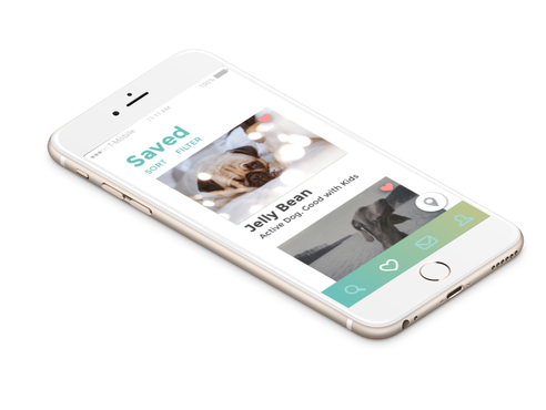
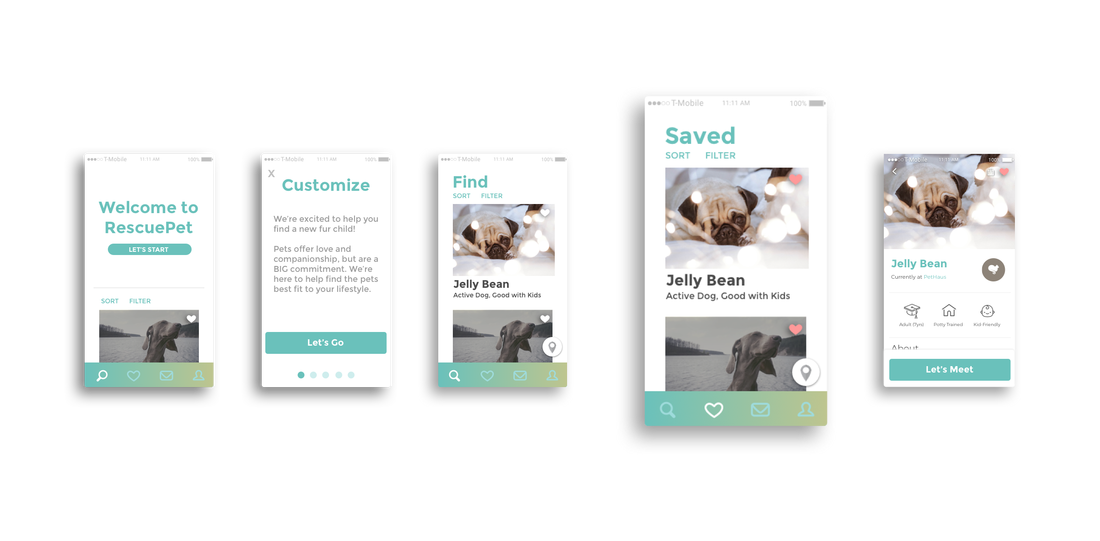
After working through a few versions of the app architecture and getting continuous feedback from stakeholders, it's time for High-Fidelity design mode. This phase is seldom a one-step process and typically goes through a couple iterations before landing on a high-fi design that is "just right." It's critical to properly integrate branding elements and ensure consistency through the experience; and important to remember that the interface of the product is the initial handshake that your users will have with what you're building.
Through both experience and time-tested studies, I firmly believe that aesthetic designs are perceived to be "easier to use" by users and are critical for user retention. I chose this aesthetic because I created the goal for the application to communicate trust, playfulness, yet ensure simplicity end-to-end. The goal of the final hi-fi design was to marry a sound, easy-to-navigate architecture with playfulness/trust/friendliness in the final UI.
Through both experience and time-tested studies, I firmly believe that aesthetic designs are perceived to be "easier to use" by users and are critical for user retention. I chose this aesthetic because I created the goal for the application to communicate trust, playfulness, yet ensure simplicity end-to-end. The goal of the final hi-fi design was to marry a sound, easy-to-navigate architecture with playfulness/trust/friendliness in the final UI.
(Bonus) The Browser
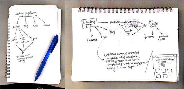
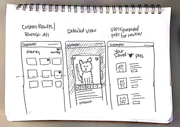
For this project, it would be very important to develop a browser accessible experience as many (perhaps a majority) of owners will be beginning their search through the web, if on a device. The app would be promoted as a top-level item on the site and through shelter's sites, and is beneficial for a more focused experience but for the users who won't bother to download the app, it's important to have a consistent browser-accessible experience. As a bonus, I sketched out what the architecture and user flow may look like for an online browser experience. Please note this section is only to be serves as a bonus to the design exercise.
Thank you for visiting!
It's been a pleasure working on this design.
Questions or comments? [email protected]
It's been a pleasure working on this design.
Questions or comments? [email protected]


